the UNboring place for inspiration
Omnia Health: a case study

PROBLEM:
Omnia Health, a functional medicine practice, had grown significantly since its founding. The original website didn’t have enough information for new patients to understand the scope of what they offered. Plus, the look-and-feel no longer fit their practice and, with very few SEO keywords, they weren’t getting found.
They knew a robust website could help grow their practice and drive efficiencies.
The doctor and staff wanted their new website to present:
• A more thorough explanation of functional medicine
• Clear statements regarding the particular types of chronic issues the practice can resolve for patients, so prospective patients could “self-qualify”
• Their expanded services, with plenty of details to answer most people’s questions and reduce the number of calls
• A thorough FAQs section to cut down on the number of calls
• An updated “Meet the Team” section with more impactful bios
• A case study section to show a track record of success resolving patient issues
• A blog with regular articles to share advice, showcase their expertise, and improve SEO
Now, with a clear understanding of the “landscape,” it was time to get started.
SOLUTION:
To address all these needs, we collaborated with a great copywriter who, through a thorough and in-depth process, captured the essence of their practice and re-organized the content to better benefit users—and giving us a framework to build our design upon. She also provided us with keyword research to improve SEO and help the practice appear in more organic searches.
While the copy was being written, we set to work, developing a clean, bright, attractive, and engaging UI design to convey health and wellbeing.
- We redesigned the global navigation to reflect the revised information architecture. This allows visitors to quickly find answers to their questions, ultimately improving user experience.
- Team bios and photos were updated with a fresh, inviting layout. While the site’s color palette is cool and calm, large photos of each member were used to add warmth, authenticity and invite trust.
- The purpose of the FAQs page is to alleviate some of the repeating phone calls received about their services, allowing staff to work more efficiently. This required a comprehensive look at the types of questions patients or potential patients frequently asked and compiling detailed answers for each while visually organizing this information so it’s easy to use. Here, we used accordions to manage all of the content for this page.
- Their old site lacked a clear Call to Action. What was it they wanted visitors to do upon arriving at their site? Ultimately, they want users to schedule a complimentary consultation. So we created a large, easy-to-read global CTA that stated exactly this—no fluff.
RESULT:
Omnia’s doctor and staff were thrilled with their beautiful and hardworking website! As this successful practice continues to grows, it will be easy to expand the website to adapt to their evolving needs. Check them out at https://omniahealthco.com.
Let’s make blogging great again!

Are you heading back to the office? Switching the “closed” sign to “open”?
Now – more than ever before – it’s important to communicate with your customers and blogging is a great way to keep in touch…
But do you feel like blogging is a chore?
Here are 6 blogging ideas to easily (and regularly) communicate with your customers:
- Address today’s issues in a straightforward manner – Clearly explain how you are doing business and what you expect of your customers. For example, explain why a limited number of people will be allowed in your store or office at a time. You can add a PDF stating new guidelines to your blog post.
- Include photos and videos – Show that your employees are back to work. Images help forge an emotional connection with your customers. Remember, a picture’s worth a thousand words!
- Recycle older and “evergreen” articles – Republish instructional articles and case studies that are still relevant. In addition to providing helpful content, you are staying top-of-mind with your customers.
- Aim for a word count of 300 words – This is a “Goldilocks” goal. It’s easy for your customers to read, and it’s an easy length to write.
- Start a list of topic ideas – When inspiration hits, toss a scribbled note into a file. This makes it a LOT easier to blog regularly.
- Improve SEO with a plugin – This useful tool gives you step-by-step guidance to improve SEO.
Need help? Give Lauren Graphics a call!
Color Schemes: A Beginner’s Guide

A color scheme consists of a combination of colors, including one or more of the twelve colors of the color wheel. By pairing different colors you can create endless eye-catching color palettes to use in any application. Different color combinations evoke different moods or messages and this becomes very helpful in visual branding and marketing campaigns.
Here are the main 3 color schemes to help get you started on your color-pairing adventures. Just know there are other schemes out there and plenty of color palette tools to help, like this one.
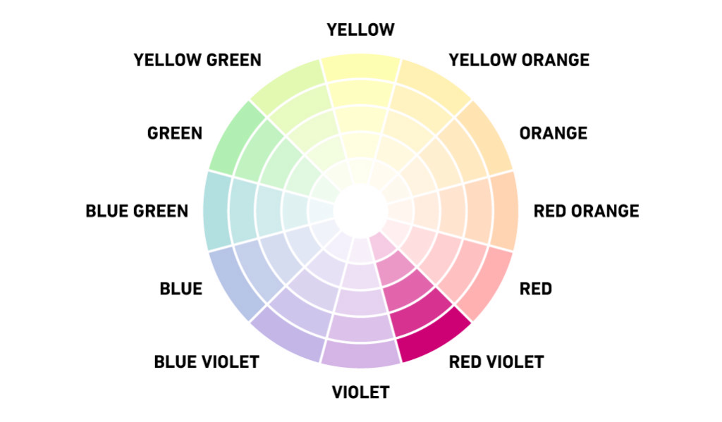
MONOCHROMATIC
Focus is on a single color, often using variations of that hue by incorporating tints, tones, and shades. Monochromatic color schemes are definitely trending right now due to the rise of minimalism in all aspects of design, from interior design to website design.
CAUTION: Because there is only one color to focus on, it is important to incorporate other elements of contrast to guide the eye throughout your design. This also helps reduce the risk of your design being flat and boring.
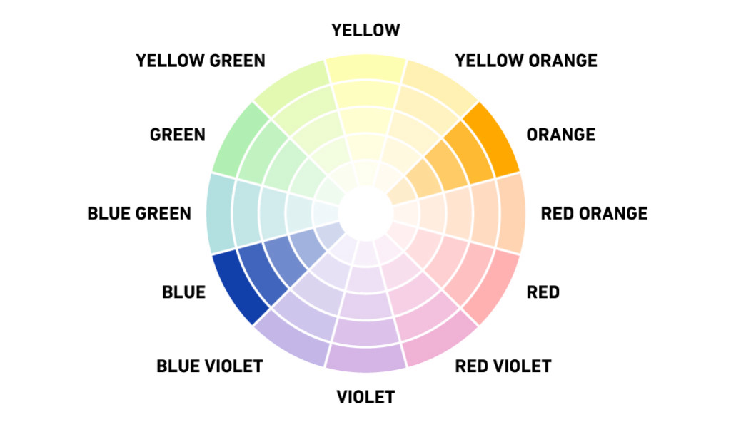
COMPLEMENTARY
Colors exist on opposite sides of the color wheel; one color is usually a primary color and the other a secondary color. The main complementary colors are typically blue and orange, red and green, and yellow and purple. These colors provide high contrast when paired together.
CAUTION: Complementary colors can be too intense for the viewer at full saturation. To tone down the intensity, incorporate tints, tones, and shades to extend the palette, just like with the monochromatic color scheme.
ANALOGOUS
The word “analogous” means closely related, so the combination of these three colors that border each other has a harmonious appeal similar to that of monochromatic color schemes.
PRO TIP: Try using exclusively cool or warm colors together.

IN CONCLUSION
Monochromatic color schemes are a simple and elegant way to add subtle texture and calmness to a design. Complementary color schemes add bright contrast and energy when used correctly. And Analogous color schemes are are nice happy-medium.
Just remember to avoid using too many colors in their fully saturated state. Bring in hints of white, grey, or black to tone down the vibrancy and expand on the palette. You’ll be choosing colors like a designer in no time!
source: https://www.shutterstock.com/blog/color-scheme-definitions-types-examples