Color Schemes: A Beginner’s Guide
A color scheme consists of a combination of colors, including one or more of the twelve colors of the color wheel. By pairing different colors you can create endless eye-catching color palettes to use in any application. Different color combinations evoke different moods or messages and this becomes very helpful in visual branding and marketing campaigns.
Here are the main 3 color schemes to help get you started on your color-pairing adventures. Just know there are other schemes out there and plenty of color palette tools to help, like this one.
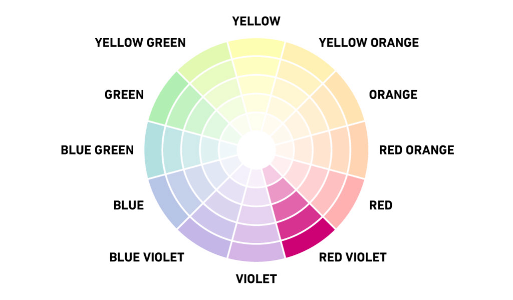
MONOCHROMATIC
Focus is on a single color, often using variations of that hue by incorporating tints, tones, and shades. Monochromatic color schemes are definitely trending right now due to the rise of minimalism in all aspects of design, from interior design to website design.
CAUTION: Because there is only one color to focus on, it is important to incorporate other elements of contrast to guide the eye throughout your design. This also helps reduce the risk of your design being flat and boring.
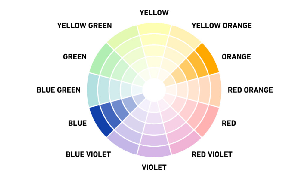
COMPLEMENTARY
Colors exist on opposite sides of the color wheel; one color is usually a primary color and the other a secondary color. The main complementary colors are typically blue and orange, red and green, and yellow and purple. These colors provide high contrast when paired together.
CAUTION: Complementary colors can be too intense for the viewer at full saturation. To tone down the intensity, incorporate tints, tones, and shades to extend the palette, just like with the monochromatic color scheme.
ANALOGOUS
The word “analogous” means closely related, so the combination of these three colors that border each other has a harmonious appeal similar to that of monochromatic color schemes.
PRO TIP: Try using exclusively cool or warm colors together.

IN CONCLUSION
Monochromatic color schemes are a simple and elegant way to add subtle texture and calmness to a design. Complementary color schemes add bright contrast and energy when used correctly. And Analogous color schemes are are nice happy-medium.
Just remember to avoid using too many colors in their fully saturated state. Bring in hints of white, grey, or black to tone down the vibrancy and expand on the palette. You’ll be choosing colors like a designer in no time!
source: https://www.shutterstock.com/blog/color-scheme-definitions-types-examples
Back to Unblog